It’s always a good idea to give your website a new coat of proverbial paint every so often. With the release of Drupal 8, we took the opportunity to not only upgrade our technology, but to completely redesign the look and feel along with the Drupal architecture. Although we did not engage in formal sprints for this internal redesign process, we did work in an iterative manner. Keeping in touch with what was liked and what was unsuccessful as we went along was important. It allowed us to create a completed product that may have looked different from our first vision, but satisfied all of the design requirements.
After the decision was made to redesign and update our site, we started by looking at what we had, what we liked about what we had, and what we wanted to add or change. As part of that process, we spent time looking at other websites for what we felt was successful, as well what worked for them (but maybe didn’t work for us).
Many spreadsheets were made, conversations had, and decisions… decided.
Starting Point

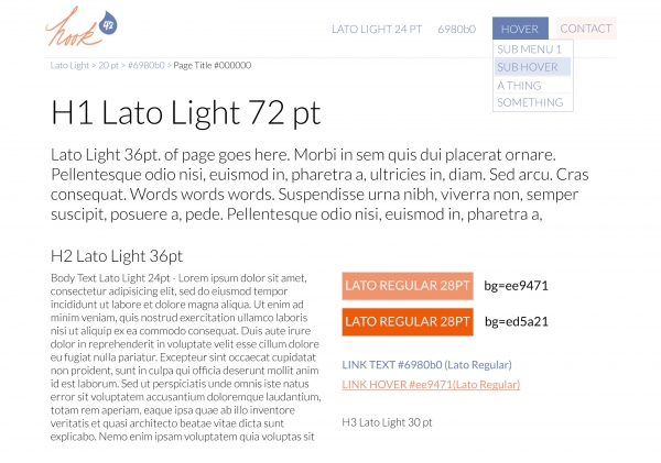
Once the general direction of the look-and-feel were agreed upon, it was time to get started on actually designing the new site. As a starting place, we created a style guide which included all of the fonts, sizes, and colors we might include in the designs. Additionally, we created a sort of “living style guide” in our Drupal 8 dev environment that could easily be updated to show us bulleted lists, drop-downs, etc.
This framework allowed for us to keep the look-and-feel consistent across the site. We knew what fonts to use where, what colors we could use to create visual interest, and - if needed - we could always update the style guide to reflect the changes we found necessary. If our original font choice or color just did not make sense with where the design was headed, we could update the style guide and make sure the new design direction still fit in with the overall feel of the site.
An Example
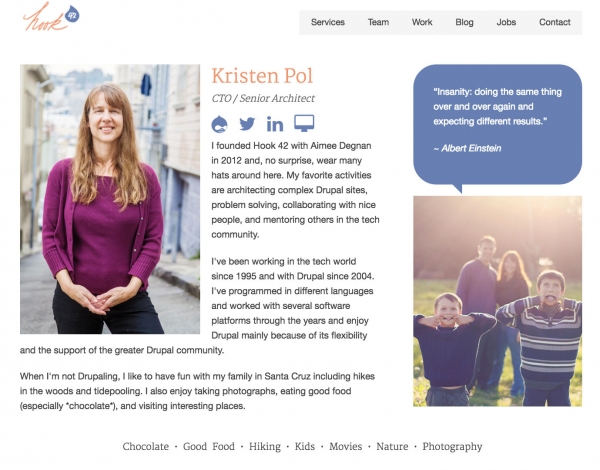
Let’s walk through the design process by taking a look at our Team Member Detail page. We knew that we wanted to update the page to make sure it felt clean, professional, and friendly. We determined which content we wanted to keep, and which parts we no longer wanted.

Our old Team Member Detail page had started to feel stale. It felt a little heavy and cluttered. The prominent fonts weren’t exuding the sense of clean modern lines we wanted for the site. The biography itself felt a little one note.
However, we enjoyed the personality each team member got to add to their page with the featured quote and interests - so those were keepers. Of course, the “standard” things like a name, title, photo, and social media links were also going to stay on the page.
Some small additions we decided to include: location (because we have a distributed team), and links to recent blog posts. We have also allowed and planned for the option of future additions of recent presentations, certifications, and/or notable Drupal contributions.
First Iteration

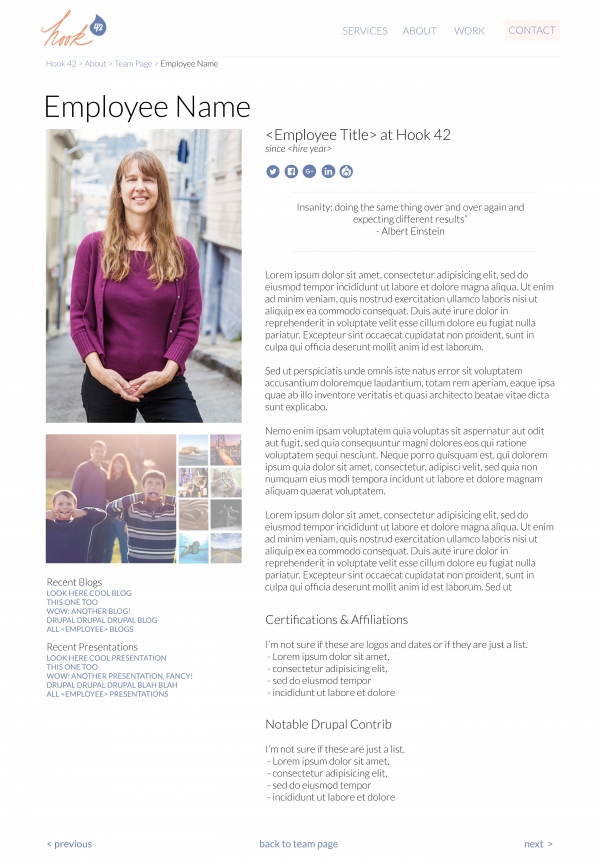
On the first iteration we went big. We included everything we had talked about adding. The immediate conclusion? It was too much for now, but it was headed in the right direction.
By changing the font to a thinner sans serif font, the design started to have the clean modern look we wanted. We still created a sense of the personality of the employee by featuring the quote above the rest of the bio, and added a cluster of interest photos rather than the text tags. The added navigation at the bottom of the page also felt nice, it was a simple way to click through our whole team - or to go back to the landing page.
A few things were less successful. The amount of content that would need to be created to fill out the certification, contribution, and presentation sections was too much for the moment. We wanted to focus on getting a good product out sooner, rather than the most complete-ultimate-end-all-be-all page out…. later…. or worse yet never.
Getting Feedback
With each stage of the design we would reach out to the members of the design and decision making teams for feedback. This feedback would happen in two ways: during our standup we would briefly take a peek at the designs so everyone knew what was going on, and/or we would have one-on-one (or small group) meetings to go over the nitty gritty details.
While we found it important and useful to keep the team in the loop, we also worked to maintain control of the design. We didn’t want to fall into the traps of “too many cooks” or “design by committee”.
Final Design

After going through a handful of rounds of applying feedback we came up with our final MVP design.
-
The design felt clean, professional, and friendly.
-
We used our brand colors to liven up an otherwise fairly text heavy page.
-
Each team member’s personality was still clearly highlighted.
-
We added the most important supplemental links (blog articles).
The design was ready to hand over to our developers for building, theming, and content migration.
Since this is only the MVP for our new Team Member Detail page, there will undoubtedly be more rounds of iterative design as we roll out new sections on our site.
Conclusion
We began our process with the need for an updated look-and-feel for our site. With the release of Drupal 8, it seemed more timely than ever. As it sometimes happens on a project - we decided we needed more than a new paint job, we needed (and wanted) to tear it down, save the good pieces and build something new it its place.
Although at first that might sound like a daunting task, taking the time to prepare and organize your thoughts and requirements makes all the difference.
-
Research competitors in your industry
-
Find broad adjectives that describe how you want to be perceived
-
Review sites outside of your industry - look for what you do and don’t like
-
Try to figure out why the sites are inspirational
-
-
Plan out the fields you want in each Drupal content type before you design a page
-
Get quick constructive feedback so you can keep moving forward
Because the design approach is iterative, even the “final” product has room for growth when needed. It is a great way to continue to evolve the look-and-feel of your design, without getting too hung up on unimportant details along the way.
We’re looking forward to sharing our new Drupal 8 site with you soon!
(If you are reading this after the update, hope you are enjoying the new look.)
